1/6


Material Design Color
1K+下载次数
2.5MB大小
4.0(17-04-2021)最新版本
详情评价版本信息
1/6
Material Design Color介绍
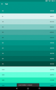
颜色:
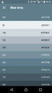
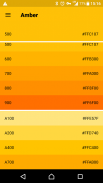
在材料设计的颜色是用柔和的环境中,深阴影和明亮的高光并列大胆的色彩灵感。
调色板:
此彩色调色板包括可用于说明或发展你的品牌颜色主要和口音的颜色。他们已经被设计为相互协调工作。调色板与原色开始,在频谱充满创造的Android,Web和iOS的一个完整的,可用的调色板。谷歌建议使用500种颜色在您的应用程序的原色和其它颜色作为点缀色。
通过Eajy中国设计。
Material Design Color - APK信息
APK版本: 4.0程序包: com.eajy.materialdesigncolor名称: Material Design Color大小: 2.5 MB下载次数: 143版本: 4.0发布日期: 2024-05-30 15:46:27最小屏幕: SMALL支持的CPU:
程序包ID: com.eajy.materialdesigncolorSHA1签名: 46:0C:C4:69:63:B6:51:25:41:82:49:DE:1D:94:6A:85:78:0A:B6:7C开发商 (CN): Eajy组织 (O): 本地 (L): 国家/地区 (C): 86州/市 (ST): 程序包ID: com.eajy.materialdesigncolorSHA1签名: 46:0C:C4:69:63:B6:51:25:41:82:49:DE:1D:94:6A:85:78:0A:B6:7C开发商 (CN): Eajy组织 (O): 本地 (L): 国家/地区 (C): 86州/市 (ST):
Material Design Color的最新版本
4.0
17/4/2021143 下载次数2.5 MB 大小
其他版本
3.9
8/6/2020143 下载次数2.5 MB 大小
3.8
28/2/2020143 下载次数2.5 MB 大小


同类应用
 3.774.324.624.44
English


